A new look, but still a familiar look
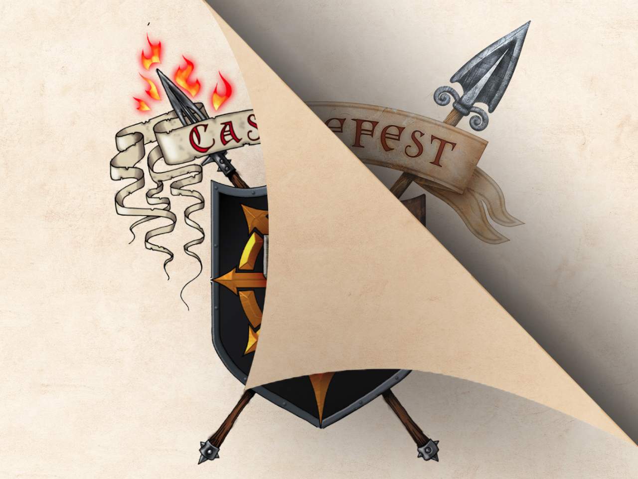
For quite some time, we've been working behind the scenes on a new logo for Castlefest. This was not an easy process. The well-known shield has been closely tied to the event since the very first year. Therefore it's not something we want to part with easily. Yet, for quite a long time we've felt that some revamping is needed.
In recent years, we sat around the table with various designers about the matter. Several designs were presented, but it never 'clicked'. The proposed designs were just not what we were looking for, they lacked magic and didn't feel right. It was clear that our logo couldn't be replaced just like that!
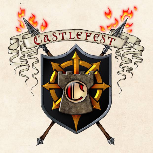
Maybe you have seen this before, but the shield has had a few minor upgrades or changes over the years. Our shield logo has its origin in 2005. It was designed by Steve from the band Omnia and features elements such as a castle tower, the C of Castlefest and a chaos wheel.
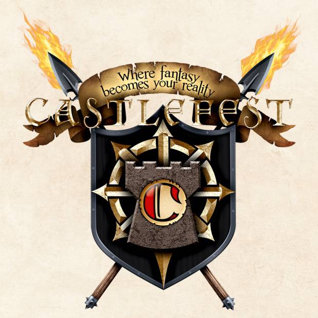
About ten years ago, we made some attempts to modernize this logo. Whereas the first shield had more of a drawn vibe, this version was given a 3D look. The banner above the shield no longer had 'Castlefest' as text, but our motto: 'Where fantasy becomes your reality'. The text 'Castlefest' was placed over the logo.
We didn't quite like this version either, as we ended up using the previous variant again.
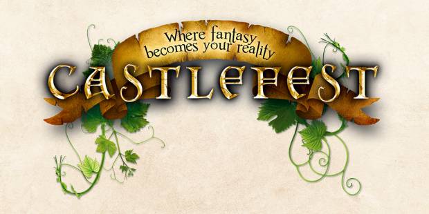
And do you remember this one pictured above? Actually, this was never a Castlefest logo, yet many saw and used this image as such. This was the header of our old Castlefest website. It basically features just the Castlefest banner and text logo.
Since finding a new logo turned out to be such a quest, we decided to keep it simple. For several years, we have been using the text logo without a shield, sometimes with curls on the side that you might know from our website branding. In outlets like our photos or CastlefestTV, our old logo, dating back to 2005, was used until recently.
A new era
Was, because it's time for the next step. The quest made us realize that the shield is an essential part of our image. We talked at length about elements that should be in the shield and what we don't want to be in it. With this information, our very own Lena did a lot of sketching, erasing and re-sketching.
Finally, a logo evolved, one that we are very happy with. Bianca of Blancko helped us with the coloured version. It's the familiar shield, but with a new look. You'll recognize it as Castlefest from afar, yet it's also new. And now it's time to share it with you.
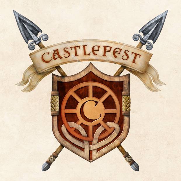
We proudly present the new Castlefest logo:
The symbolism
We love to tell you all about the symbolism behind this logo. The shield, as we already mentioned, is the core. It is a strong image and therefore of great importance. It illustrates our roots, a strong foundation on which Castlefest has been built since 2005. The trusted banner is back, with our text logo on it.
The chaos wheel has changed into the pagan year wheel. It shows our connection to the annual festivals, of which Lughnasadh is one. Castlefest revolves around this Celtic harvest festival, but the other festivals also play an important role in our story. Lughnasadh is also reflected in the outline of the shield. Grain is a typical symbol of this harvest festival.
Do you recognize the spears? We told you about Lugh in a previous blog article. For many years, he has been a familiar face at our festival as a statue and this Celtic sun god also has an important connection with Lughnasadh. The spear held by the statue is incorporated as the new spears behind the shield.
The shield outline also has a celtic knot. This illustrates that everything is connected: the elements in this logo, the magic of Castlefest, our roots and all of us as a close-knit Castlefest community.
We are very happy with this new logo. It 'clicks' and has the magic and symbolism we care so much about. We hope you like it as much as we do. This upcoming Castlefest you will find the new logo on our banners, tokens, the program booklet and merchandise.
What do you think? We'd love to hear about it!
